
Moxa Acupuncture
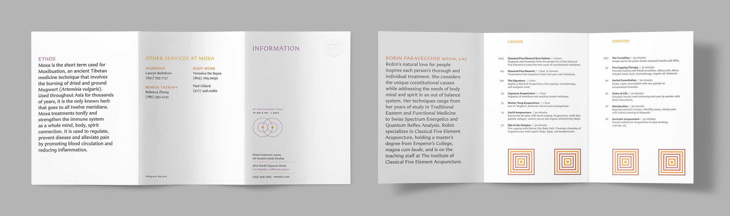
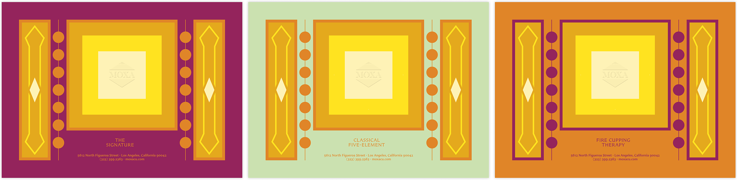
A new practice of an old tradition. Classic typography, handmade paper, and bright colors were used to communicate a newly formed contemporary practice in Los Angeles.

One of the primary goals was to match the tone of the energy of the Los Angeles neighborhood of Highland Park, where it began, to traditional Chinese medicine.
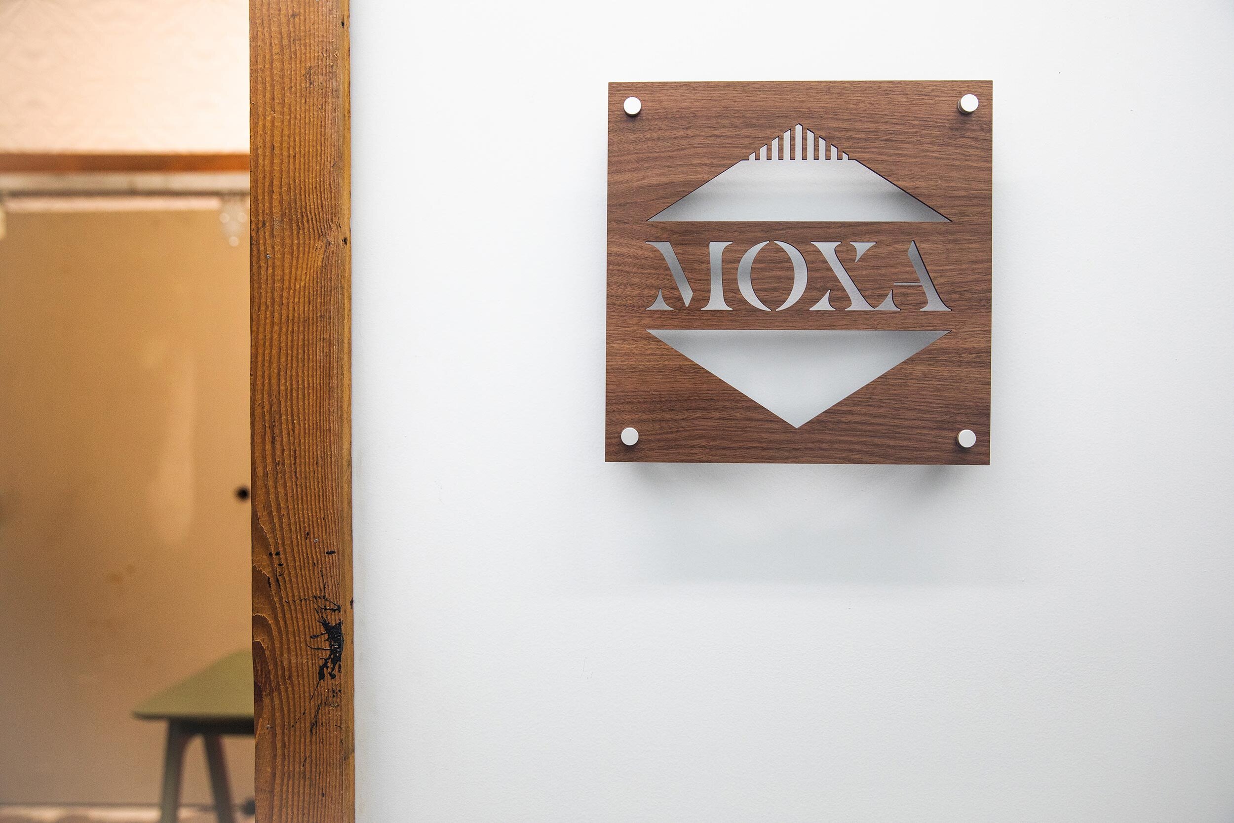
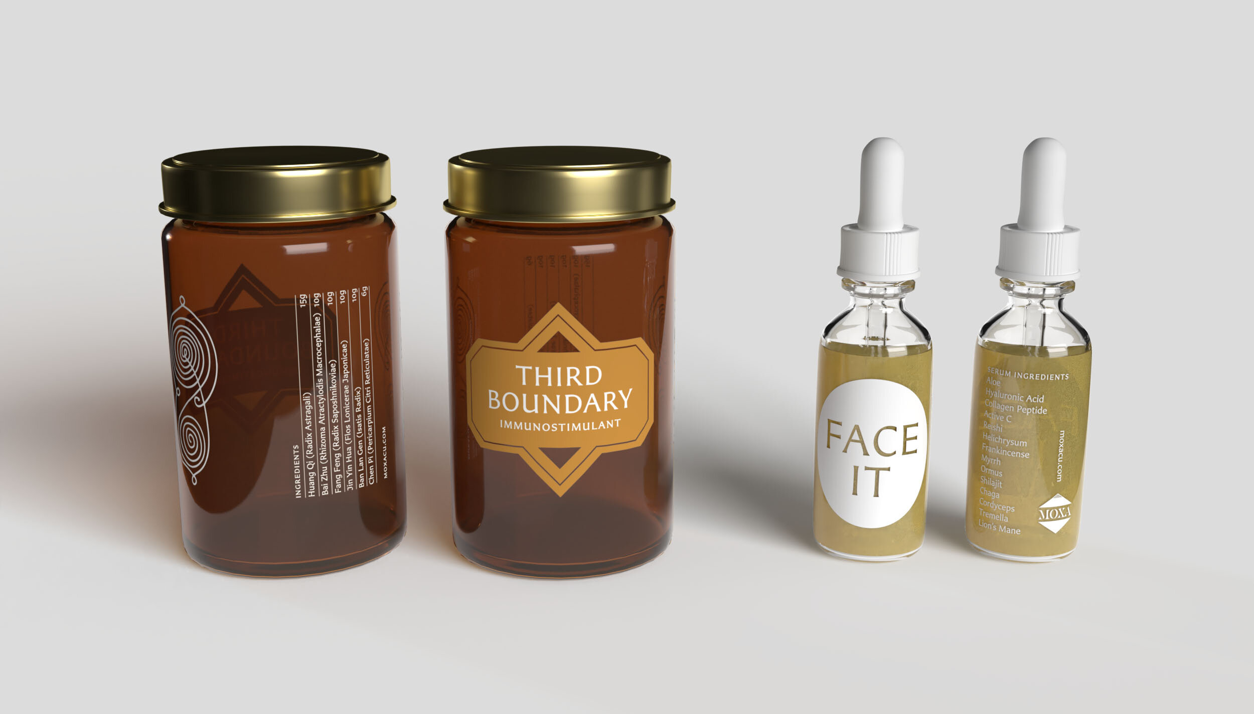
Moxa is short for moxabustion, a primary herb used by acupuncturists. This directly inspired the logo design. Moxa resembles an incense cone; the top is lit and heat transfers to specific points on the body below. It’s made from the Mugwort plant so the overall color palette was derived from an illustration of Mugwort found in Köhler’s Medicinal Plants, published in 1897.
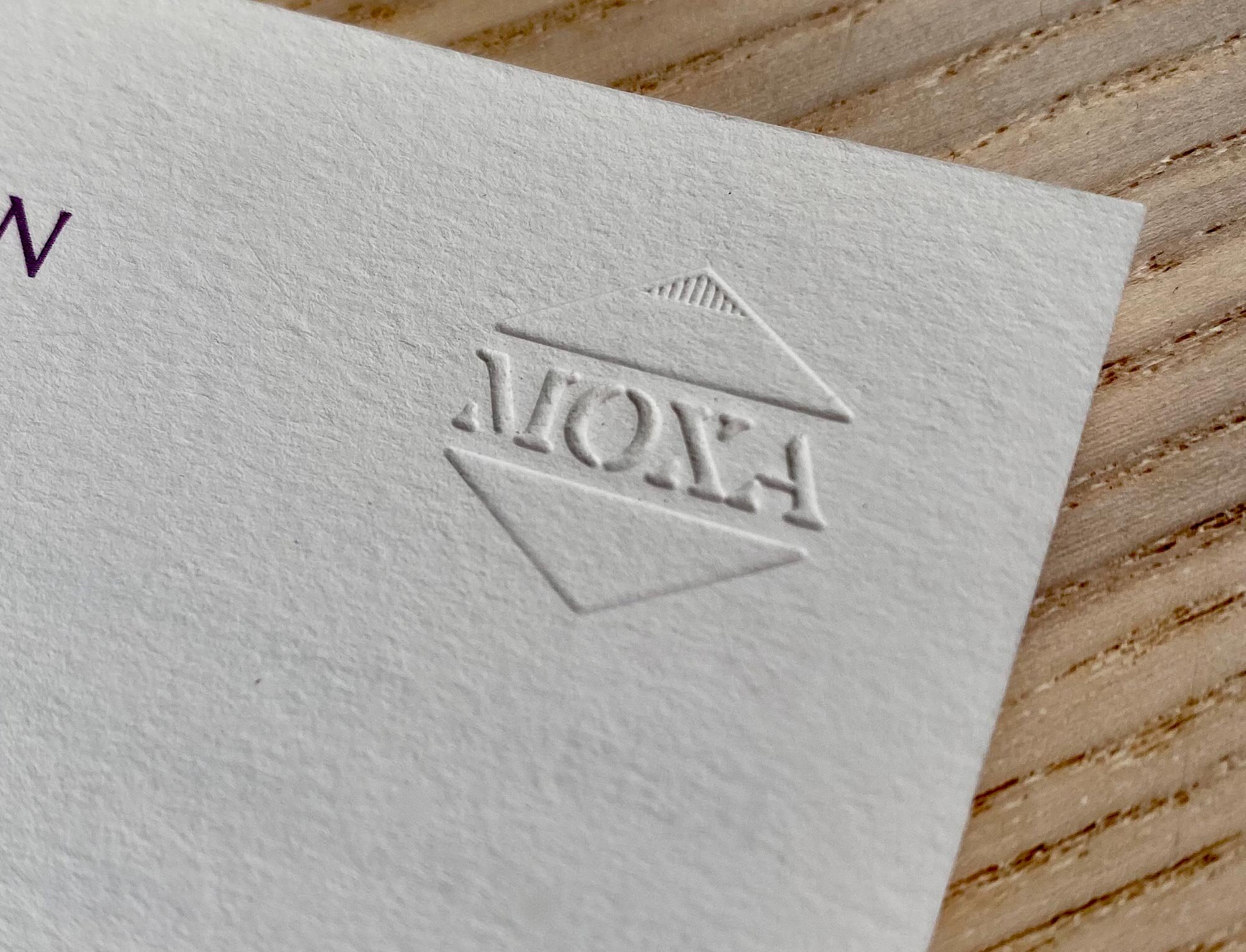
A one-color stencil version of the logo was designed which allowed it to be used on wayfinding signage. For items that were printed in small quantities, this stencil version allowed an embossing stamp to be created for hand-stamping onto items such as patient forms, gift certificates, and a price list.
Great care was given so that each element would reflect the level of the overall patient experience from possible discovery through packaging, to intake with patient forms.